
My Top 5 Picks from Clerkenwell Design Week 2026 - And What They Mean for Interior Designers Right Now
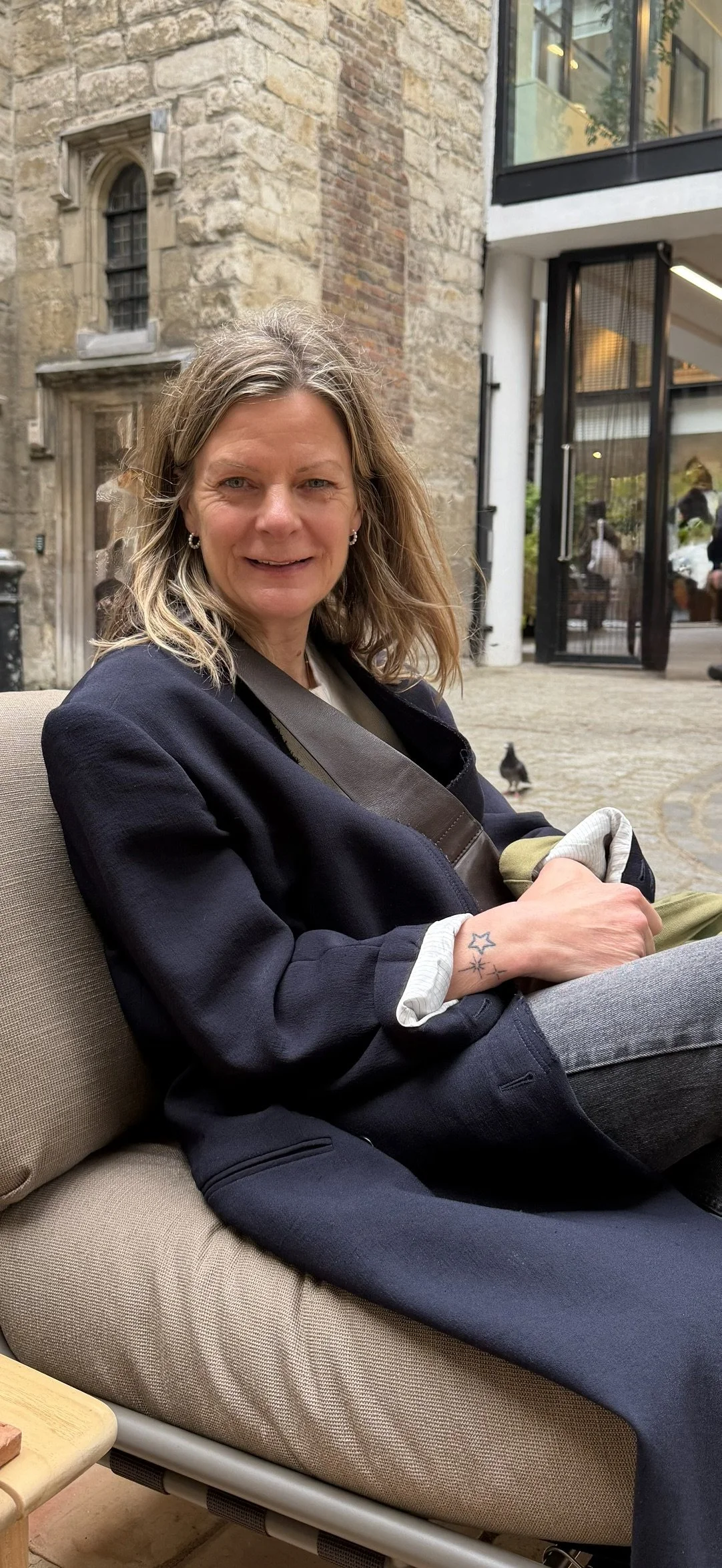
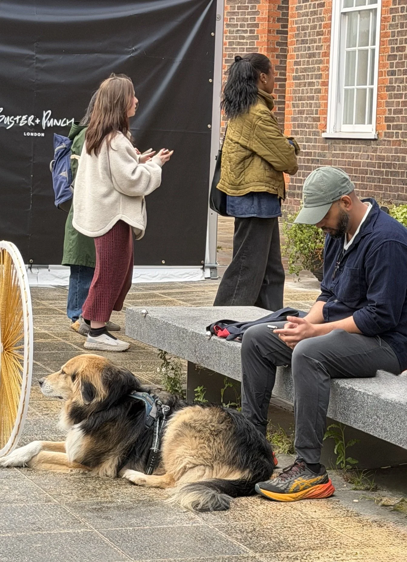
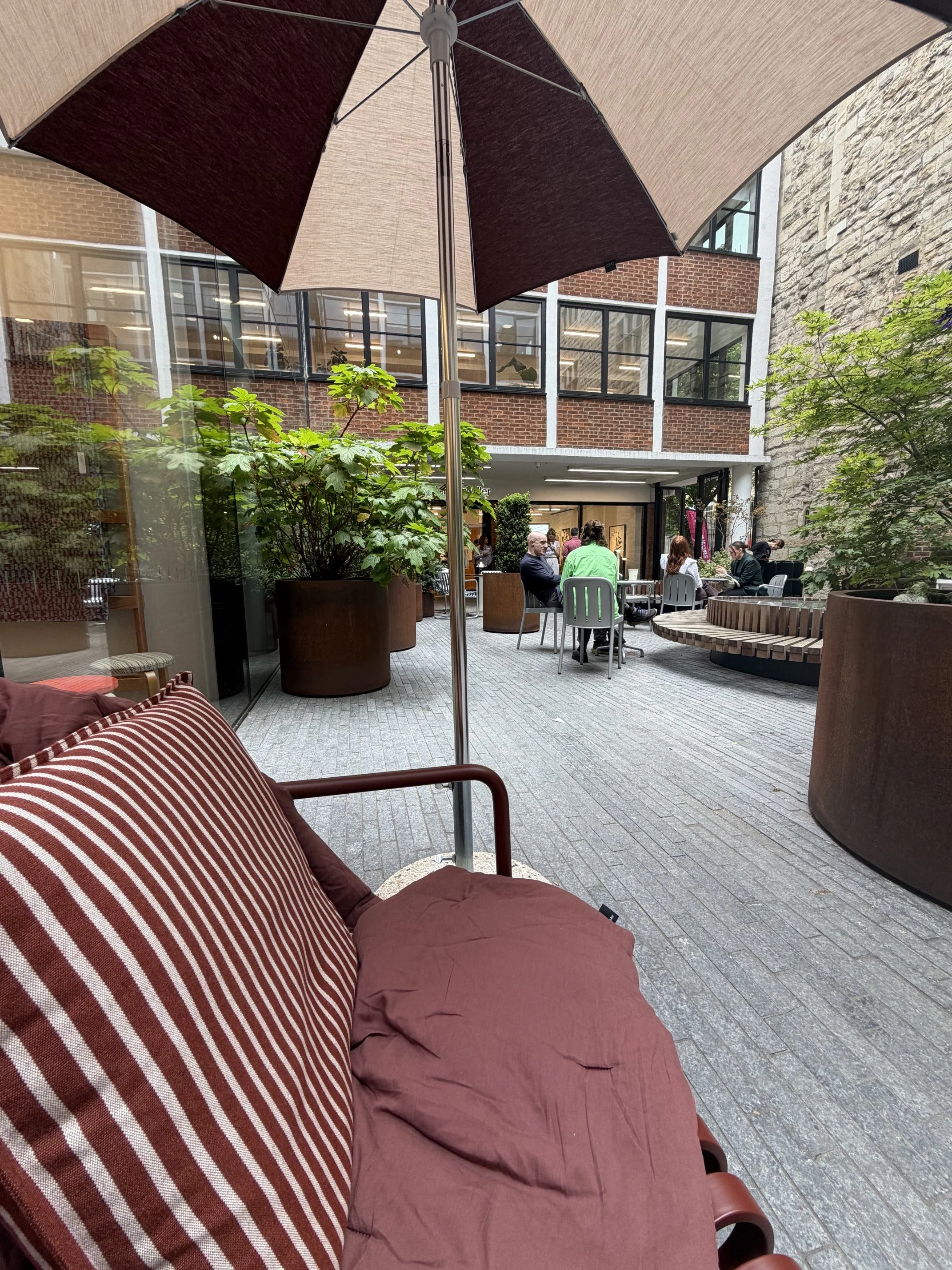

If you've never been to Clerkenwell Design Week, put it on your list for next year. Every May, one of London's most design-rich neighbourhoods transforms into a sprawling showcase of the brands, materials, and ideas that are going to shape interiors over the next 12–18 months.
I go every year. And every year I come back with the same mix of excitement and overwhelm - because the sheer volume of what's on show is extraordinary.
But the real value of Clerkenwell isn't the products themselves. It's what the products tell you about where design is heading. The materials people are investing in. The colour stories that keep appearing across completely different showrooms. The details that quietly suggest a shift in how we're all thinking about the spaces we live and work in.
This year I pulled out my five favourite finds - the ones that stopped me in my tracks, made me think, or that I know I'll be referencing in client work for months to come.
Here they are:
1. Maharam - Colour That Actually Takes Courage
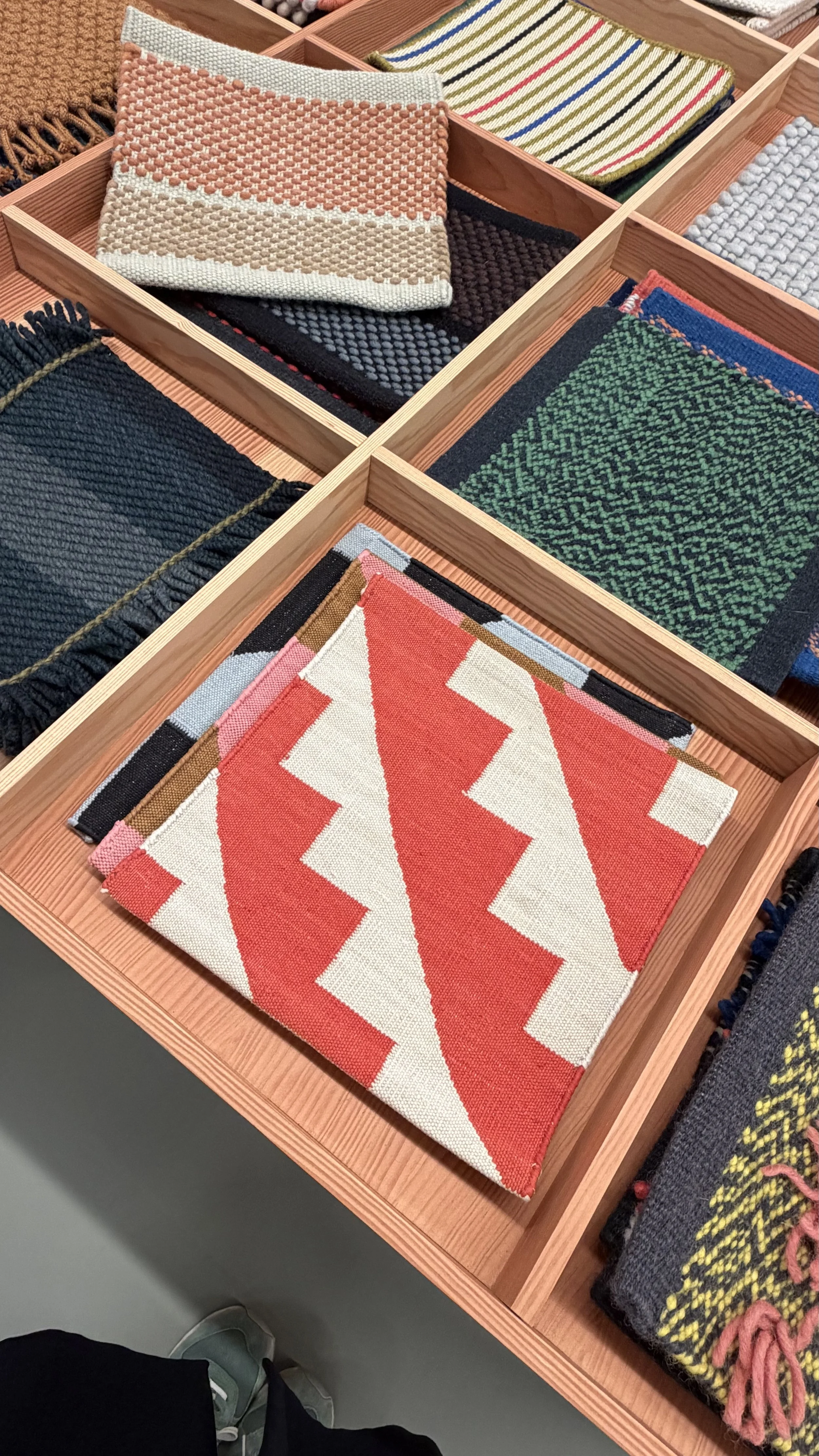
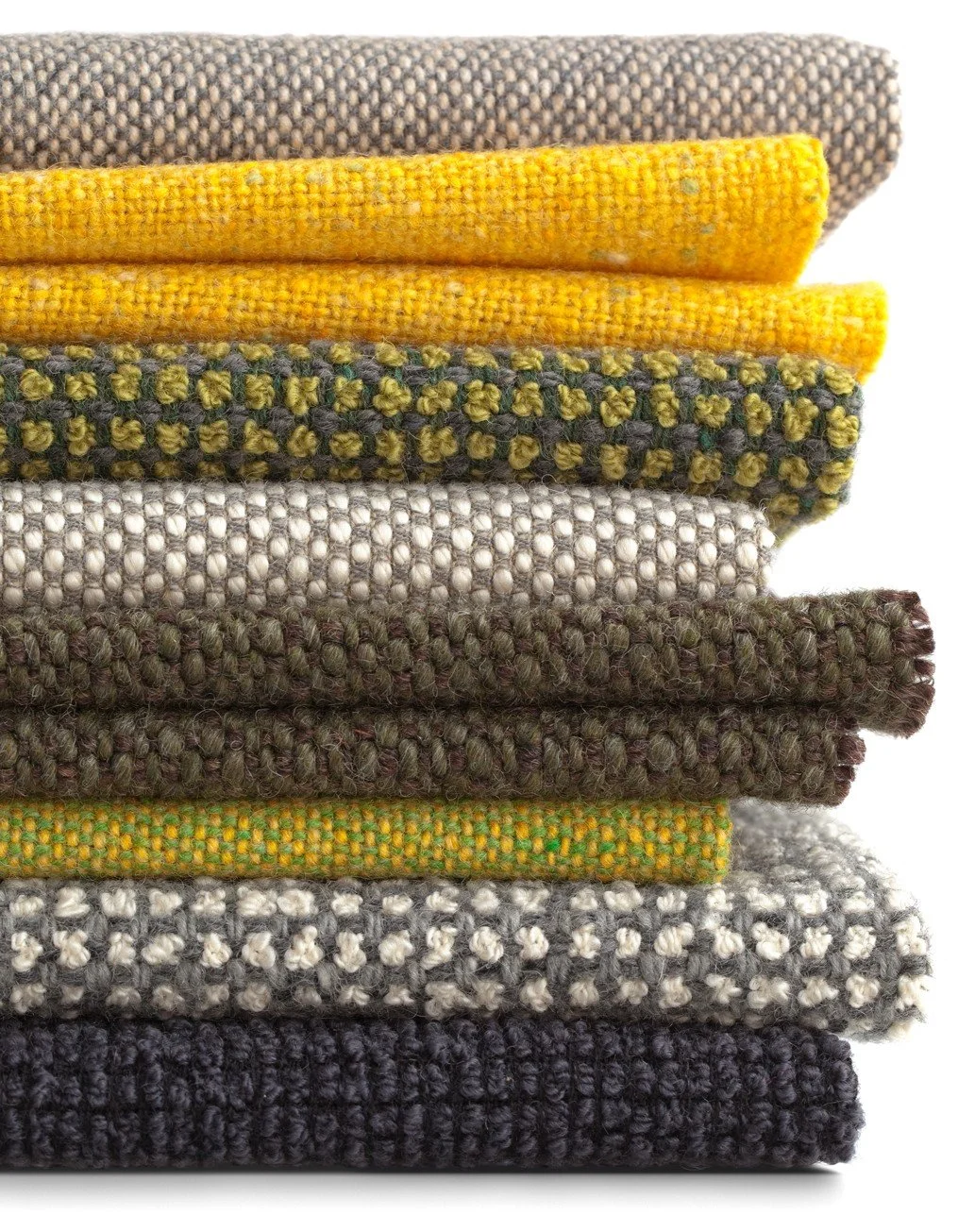
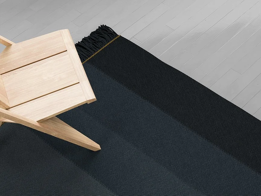
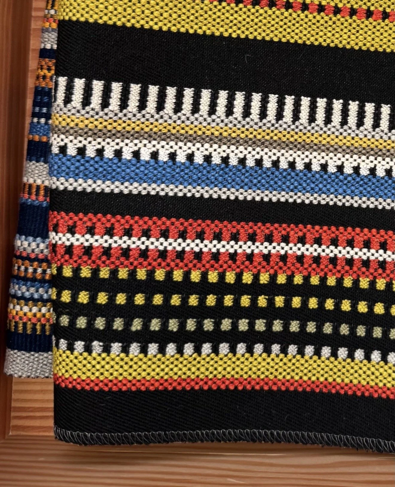
Maharam always delivers, but this year they really went for it.
What caught my eye was the combination of gutsy, bold colour paired with natural textures - and the fact that it worked. Really worked. There's a confidence to it that feels right for where interiors are heading - away from the safe and neutral, towards something that actually has personality.
Colour has a way of making people feel something the moment they walk into a room. And this collection understands that completely.
For clients who are ready to commit, I'd love to see this used to fully upholster an occasional chair as a proper focal point - the kind of piece that anchors a room and makes people stop and ask about it. For anyone not quite ready to go all in, even a couple of throw cushions in these shades against a more neutral sofa brings that same freshness without the full commitment.
Either way - this is one for the mood boards.
2. Colourville - Imperfect Paint for Imperfect People
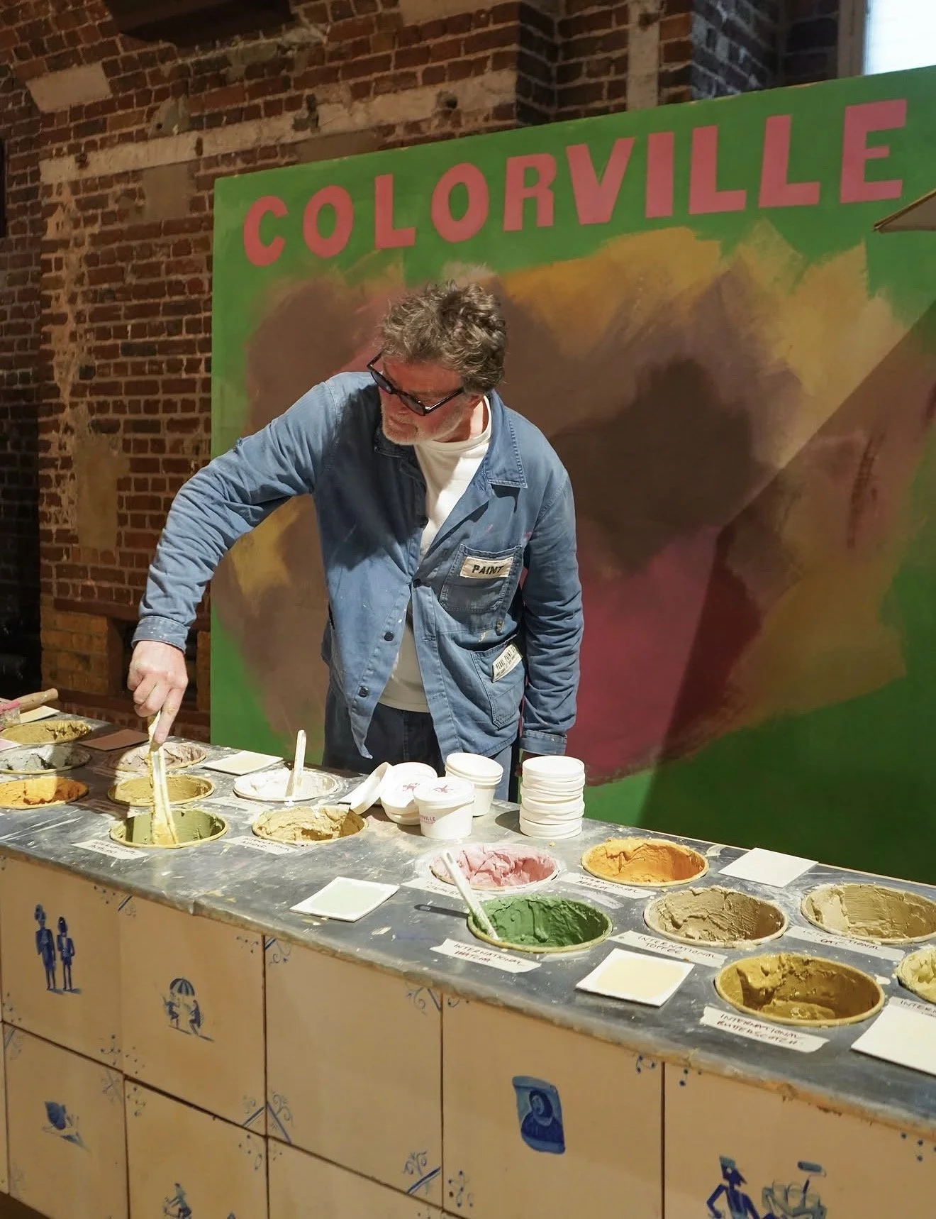
📷@colourmakespeoplehappy
This was one of my favourite discoveries of the whole day.
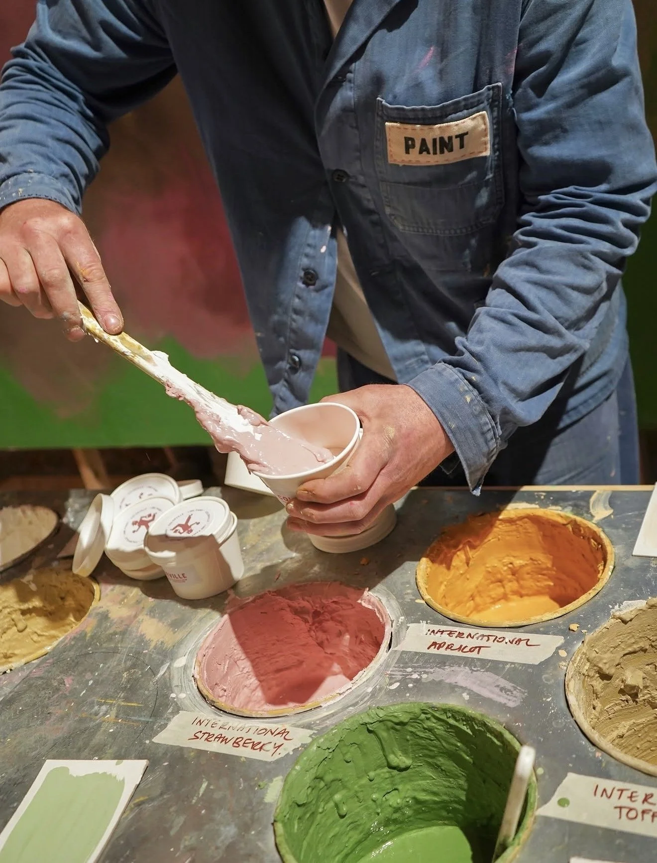
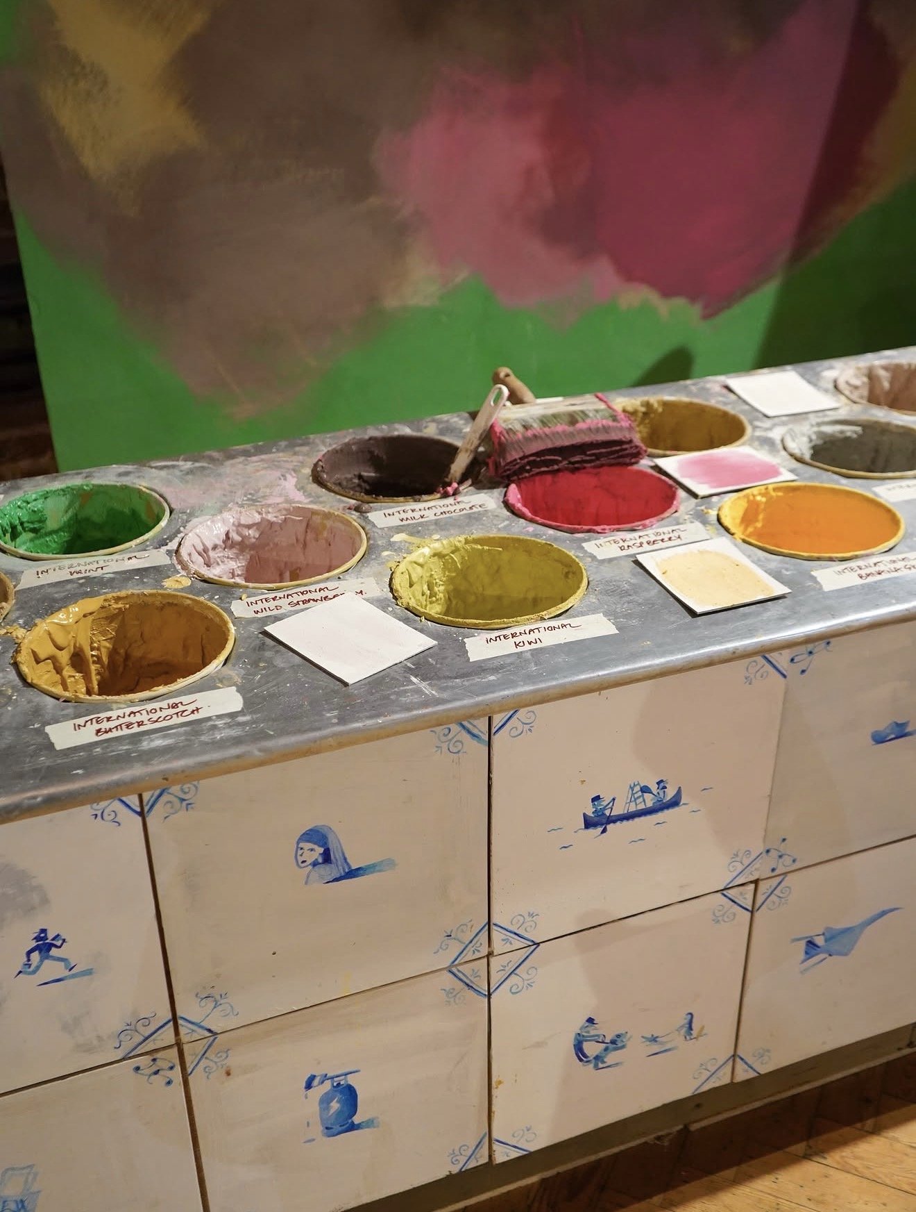
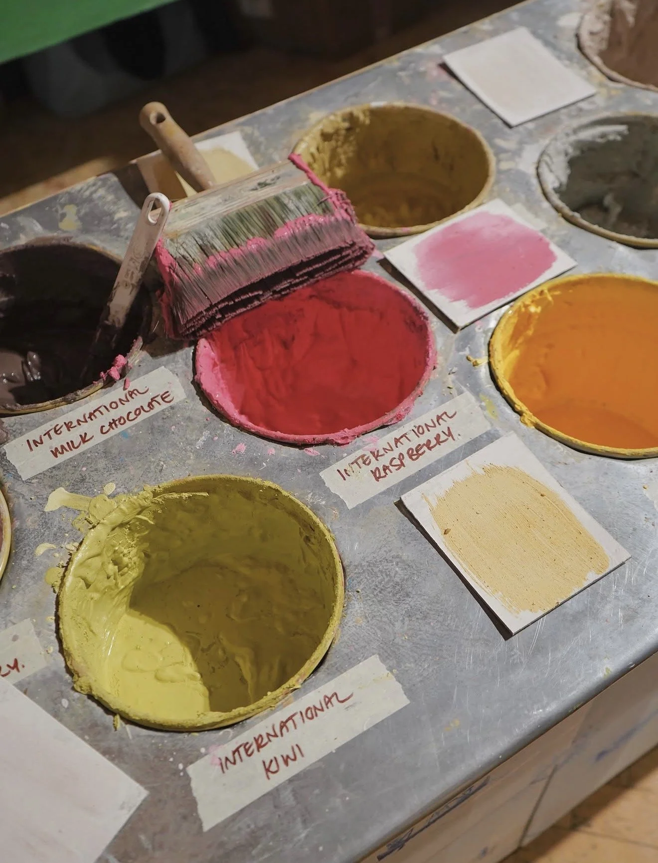
Makers of Alabastine make brush-applied paint designed for a lived-in, imperfect finish - and they've just introduced 31 new ready-made shades inspired by ice cream tones. Soft, creamy, gentle colours that feel warm and considered rather than clinical or trend-chasing.
But what really won me over wasn't any individual colour. It was the overall feeling of the collection. The softness. The texture. The way the tones have real depth without being heavy. There's something about a surface that isn't perfectly smooth and uniform that makes a room feel like a home rather than a showroom - and that's exactly what this paint delivers.
The brand's whole philosophy sits around colour making people happy. And honestly, standing in front of this collection, I completely understood what they meant.
This is paint for people who want their home to feel real. For clients who love the idea of a little character and history built into their walls - this is the one to show them.
3. Huguet Mallorca - Tiles That Feel Like They've Always Been There
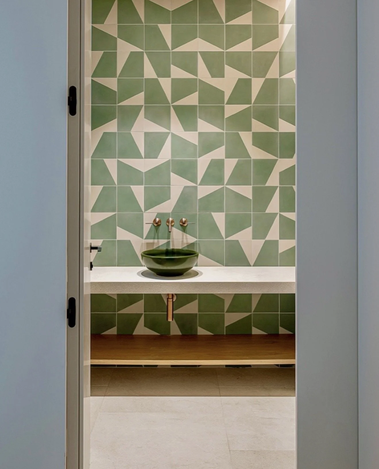
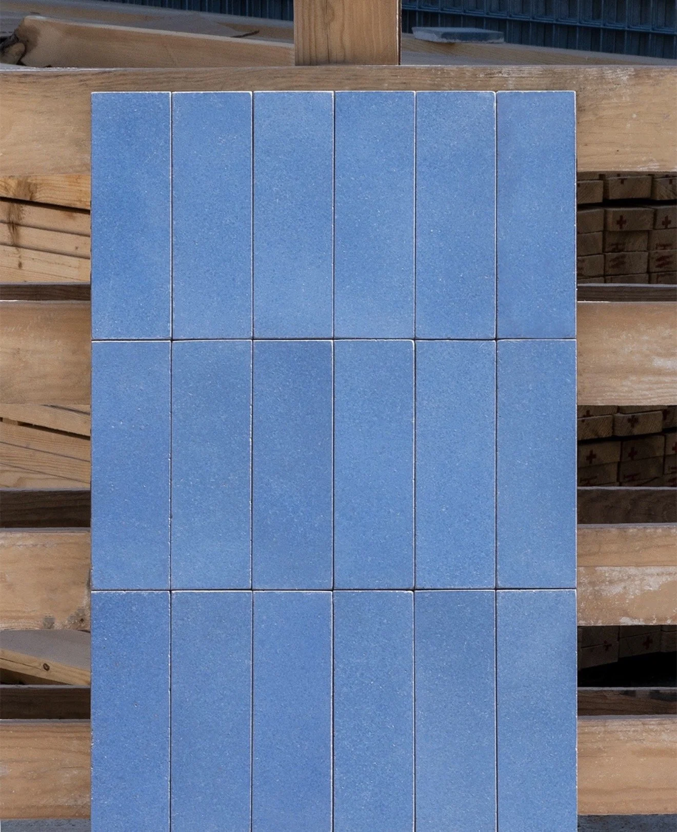
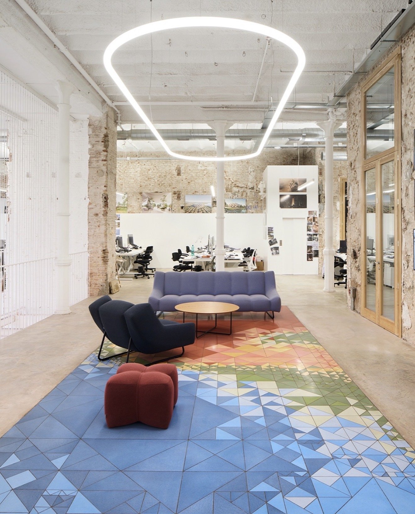
📷@huguetmallorca
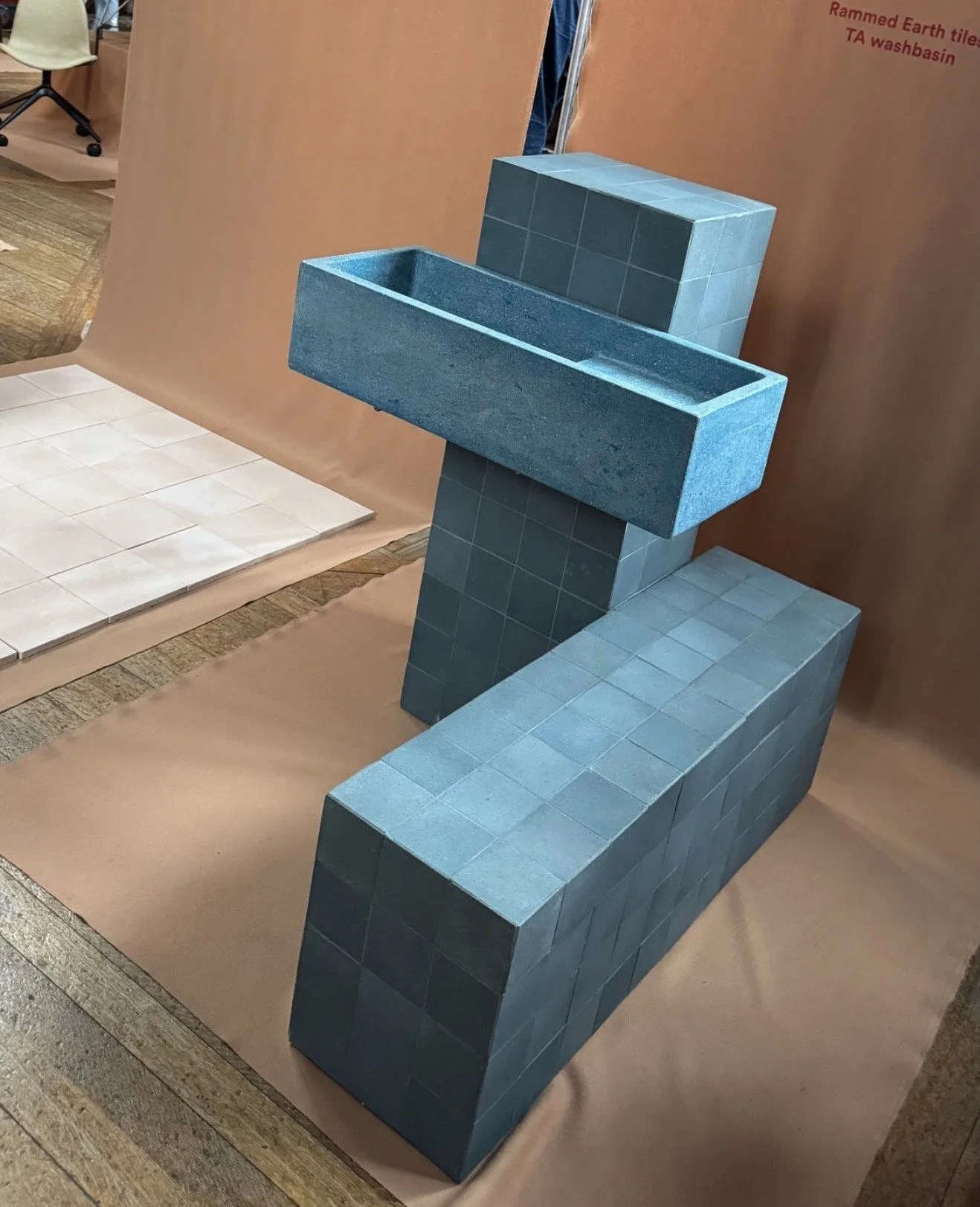
Huguet have been making handmade tiles in Mallorca for over 75 years, and you can feel that history the moment you see them.
What drew me in this year was the muted, earthy colour palette combined with the texture of the earthenware itself. These aren't tiles that shout for attention - they do something quieter and in many ways harder. They make a space feel grounded. Considered. Like it was designed by someone who knew exactly what they were doing.
The wash hand basins were equally beautiful - simple forms in the same handmade earthenware, which means the material language of a whole bathroom can be completely coherent without feeling matchy or overdone.
For any project where a client wants something that feels genuinely crafted rather than mass-produced - a bathroom, a kitchen, a hallway - Huguet is the answer. The kind of choice that makes a room look like it's been there forever.
4. Boss - Elegance With a Bit of Edge
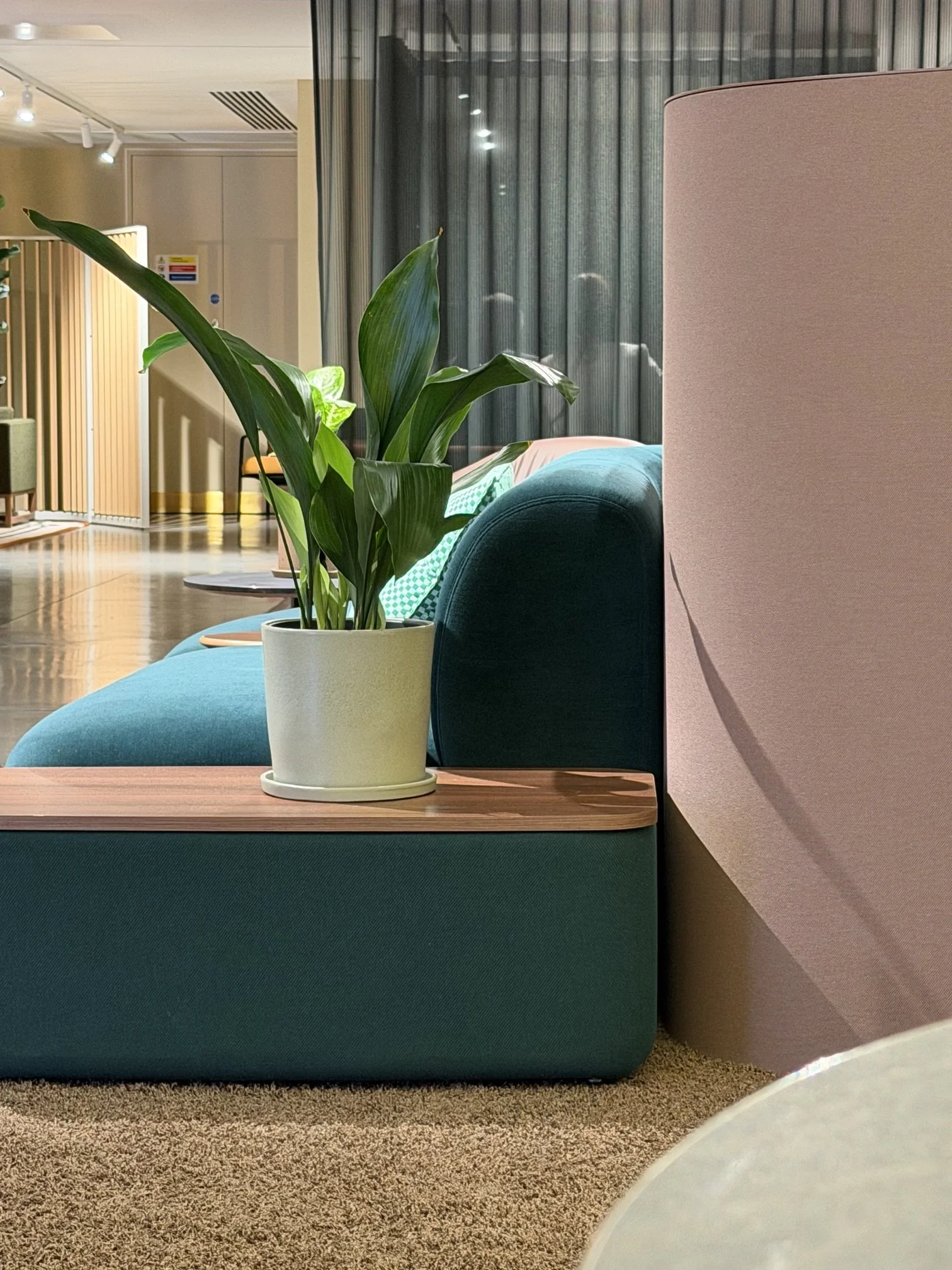
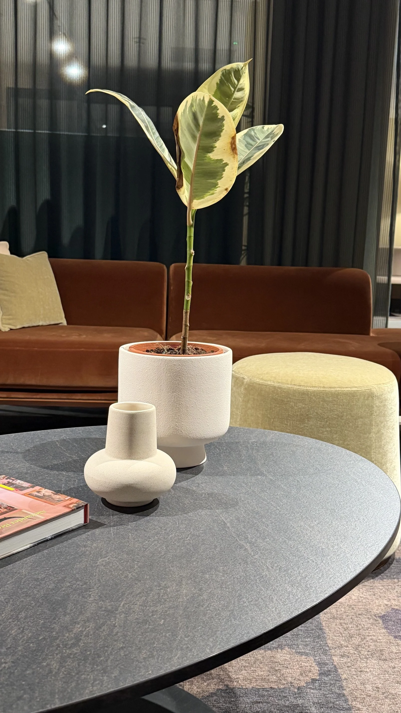


Boss at Clerkenwell was a reminder that colour and elegance are not opposites.
The collection felt refined and considered - nothing brash or overdone - but with a confidence in the use of colour that elevates it well beyond the expected. It's the kind of design that appeals to clients who want their interiors to feel polished and sophisticated, but don't want to disappear into a sea of grey and white.
This sits beautifully in a high-end residential setting - a drawing room, a principal bedroom, a home office that needs to feel serious but also inspiring. For clients who respond to quality and restraint but want something with a little more presence, this is where I'd point them.
5. Knoll - Back to Basics, Done Beautifully
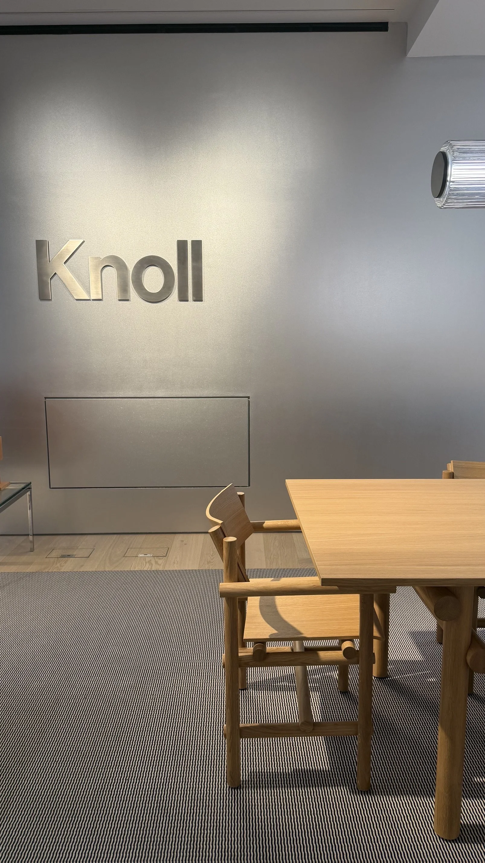

Knoll is always worth a look, and this year they reminded me why.
What stood out was the simplicity. Beautiful natural materials - bent timber in particular - handled with real restraint and skill. No fuss. No unnecessary detail. Just an understanding that when you work with a material properly, you don't need to add anything else.
This kind of design is brilliant for inspiration. Not necessarily as a direct specification, but as a reference point - a reminder of what's possible when you strip things back and let the material do the talking. I find myself coming back to pieces like this when I want to recalibrate a scheme that's becoming too complicated.
Sometimes the most sophisticated thing you can do is less.
The bigger picture - what Clerkenwell 2026 is telling us
Walking around this year, three things kept coming up across completely different brands and showrooms - which tells you something real.
Colour is back - properly.
Not as an accent or a trend moment, but as a genuine design choice that's being embraced at every level of the market. From Maharam's bold upholstery to Alabastine's ice cream shades to Boss's elegant palette - there's a clear shift away from the safe and neutral that has dominated for the past several years. Clients are ready for it. The question is whether their designers are ready to lead them there.
Texture is doing more of the heavy lifting.
Smooth, flat, uniform surfaces are giving way to materials that have tactile depth - handmade tiles, brushed paint, natural timber. People want to feel their homes, not just see them. This shows up in everything from the Huguet earthenware to the Knoll furniture, and it's a shift worth paying attention to when you're specifying.
Craftsmanship is the new luxury.
Not price point, not brand name - the sense that something has been made by hand, with care, by people who understand their material. That's what commands attention on a showroom floor and it's what clients increasingly respond to when you show them options. The mass-produced and the perfect is less interesting than the considered and the real.
What this means if you're building a design business
Here's something I always think about on days like today.
The designers who will thrive over the next few years aren't just the ones with the best eye - though that matters. They're the ones who find a way to turn what they know into a business that actually works around their life.
Walking around Clerkenwell, absorbing trends, understanding what's coming before clients even know to ask for it - that knowledge has real value. The e-design model lets you turn it into income in a way that in-person work simply can't match. A colour palette, a curated shopping list, a mood board built around exactly what you saw today - products you create once and deliver to clients entirely online, without a site visit in sight.
If you're a designer ready to take your work online and start building that kind of income, my course The E-Design Income System walks you through getting your first online client in five days.